Landing Page Product Feature Component
This component can display a product feature e.g. on your landing page, features page or elsewhere. It can show an image on the left, right or center; either in perspective or flat and has many customization options.
Use this to highlight a feature or key aspect of your product with text and an optional image.
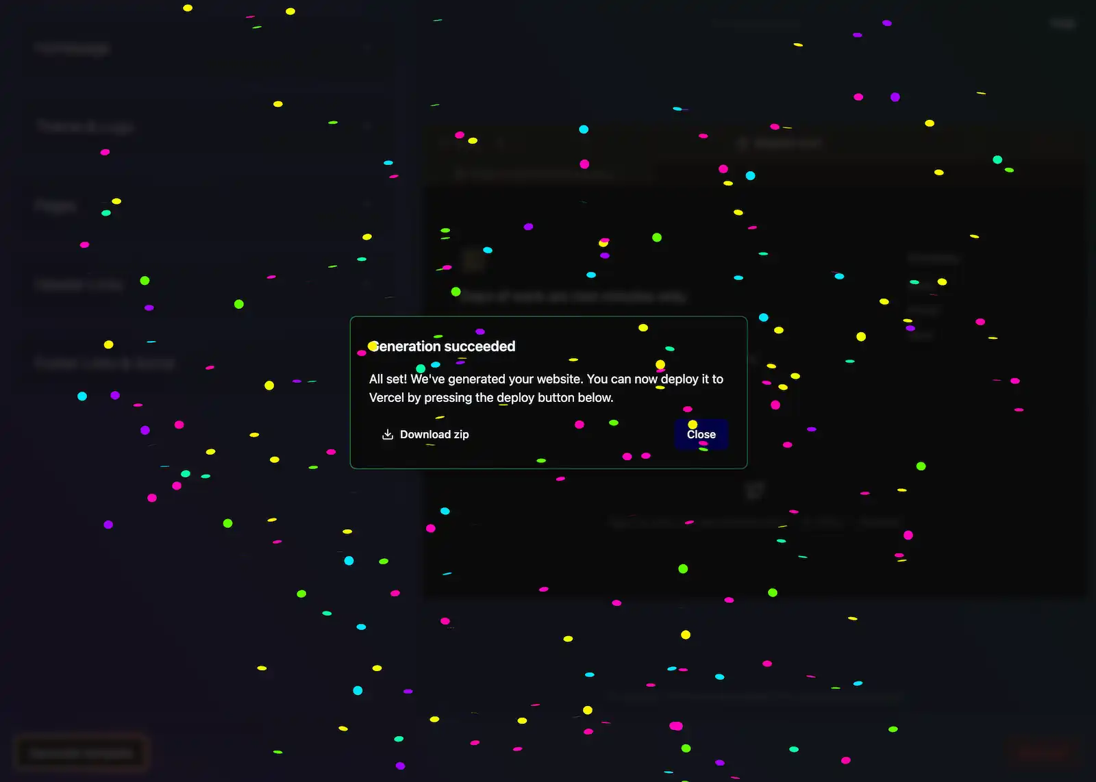
The wait is over
Give your project the home it deserves. Your users will love you for it.

Usage
import { LandingProductFeature } from '@/components/landing/LandingProductFeature';
<LandingProductFeature
title="The wait is over"
description="Give your project the home it deserves. Your users will love you for it."
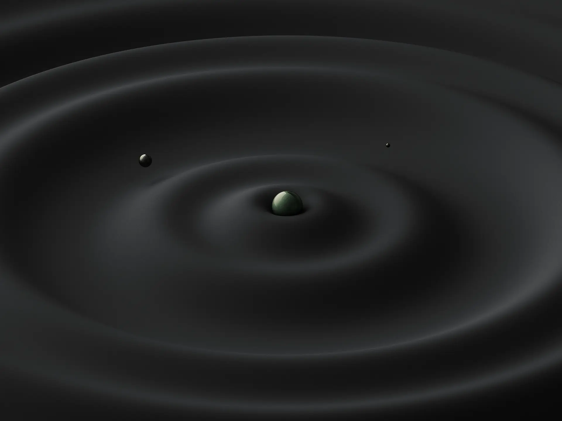
imageSrc="/static/images/backdrop-5.webp"
imageAlt="Sample image"
/>
Examples
Image position
The wait is over
Give your project the home it deserves. Your users will love you for it.
Image perspective
The wait is over
Give your project the home it deserves. Your users will love you for it.
Customization
It is also possible to customize the background color, change text position or disable zooming on hover.
The wait is over
Give your project the home it deserves. Your users will love you for it.
With Background Glow
The wait is over
Give your project the home it deserves. Your users will love you for it.
With Bullet Points
The wait is over
- Intelligent Assistance.
- Receive personalized recommendations and insights tailored to your workflow.
- Seamless Collaboration.
- Easily collaborate with team members and clients in real-time.
- Advanced Customization.
- Tailor your app to fit your unique requirements with extensive customization options.
With Call to Action (CTA)
The wait is over
Receive personalized recommendations and insights tailored to your workflow and easily collaborate with team members and clients in real-time.
Try now for free7 day free trial, no credit card required.
With Features Grid
Get the job done in no time
You'll save days of work and the only question you'll have is 'What do I do with all this free time?'
Deploy
Give your project the home it deserves.
No config
No configuration needed. We take care of it.
Themes
Choose from more than 30+ themes or create your own.
With Product Steps
How it works
Follow these simple steps to get started with our product.
Create your account
Sign up in seconds and get instant access to our platform.
Customize your workflow
Set up your preferences and configure your workspace.

Start collaborating
Invite your team and begin working together seamlessly.

With Background Effect
The wait is over
Give your project the home it deserves. Your users will love you for it.
With Leading Pill
The wait is over
Give your project the home it deserves. Your users will love you for it.
API Reference
Note: When used inside
LandingProductFeaturesGrid, some props have context-aware defaults:
imagePositiondefaults to'center'when not specifiedimageShadowdefaults to'none'when not specifiedminHeightdefaults to0when not specified
| Prop Name | Prop Type | Required | Default |
|---|---|---|---|
| children | React.ReactNode ǀ string | No | - |
| className | string | No | - |
| innerClassName | string | No | - |
| title | string ǀ React.ReactNode | No | - |
| titleComponent | React.ReactNode | No | - |
| description | string ǀ React.ReactNode | No | - |
| descriptionComponent | React.ReactNode | No | - |
| leadingComponent | React.ReactNode | No | - |
| textPosition | 'center' ǀ 'left' | No | 'left' |
| imageSrc | string | No | - |
| imageAlt | string | No | '' |
| imagePosition | 'left' ǀ 'right' ǀ 'center' | No | -* |
| imagePerspective | 'none' ǀ 'left' ǀ 'right' ǀ 'bottom' ǀ 'bottom-lg' ǀ 'paper' | No | 'bottom' |
| imageShadow | 'none' ǀ 'soft' ǀ 'hard' | No | -* |
| zoomOnHover | boolean | No | true |
| minHeight | number | No | 350 |
| withBackground | boolean | No | false |
| withBackgroundGlow | boolean | No | false |
| variant | 'primary' ǀ 'secondary' | No | 'primary' |
| backgroundGlowVariant | 'primary' ǀ 'secondary' | No | 'primary' |
| effectComponent | React.ReactNode | No | - |
| effectClassName | string | No | - |
More Examples
For more even more examples, see our Landing Page Component Examples page or see complete landing page examples by Exploring Our Landing Page Templates.
Also see:
- Product Video Feature component.
- Product Steps component.
- Product Features Grid component.
- Background Effects component for adding visual interest to a section
- Leading Pill component.