Landing Leading Pill components
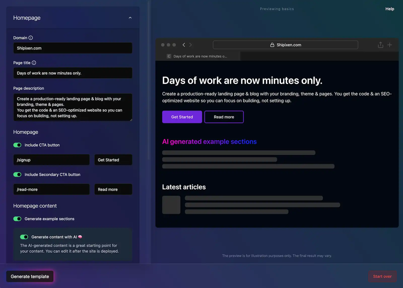
The LandingLeadingPill is a versatile inline component perfect for announcements, badges, feature highlights, and call-to-action elements. It features SVG-based borders for all variants ensuring perfect rounded corners, supports multiple color variants including rainbow gradients, glass backgrounds, and can be made clickable as either a link or button. It also supports left and right components, custom text components, children, and custom opacity.
Key Features:
- Rainbow gradient borders with smooth color transitions
- Glass background effects with backdrop blur
- Flexible content support
- Clickable variants (link or button)
- Responsive design with proper dimension handling
These work well together with LandingPrimaryImageCtaSection, LandingPrimaryTextCtaSection, LandingPrimaryVideoCtaSection, LandingProductFeature, LandingProductVideoFeature as the leadingComponent prop.
Usage
import { LandingLeadingPill } from '@/components/landing/leading/LandingLeadingPill';
<LandingLeadingPill
  text="New Feature"
  borderVariant="primary"
  textVariant="primary"
/>
Full Examples
News Announcement
With Announcement & Notification
With Announcement & Read More
With Clean Icon
With Clean Background
With Icon and Background
With Clean End Arrow
With Clean Read More
With Icon and Read More
With Start Emoji
With Stand Out Border and Badge
With Modern Glass Background
With Primary CTA
Landing page in minutes
Get 10x more done with Shadcn UI, React & Next.js, and say goodbye to repetitive tasks. You'll never go back.
With Product Feature
The wait is over
Give your project the home it deserves. Your users will love you for it.

Variant Examples
Basic Border Variants
All borders are now rendered using SVG for perfect consistency and rounded corners.
Rainbow Gradient Border Variants
Rainbow borders use SVG gradients with smooth color transitions and automatic white/black text for optimal contrast.
Text Variants
Background Variants
Text Styling
With Left and Right Components
Clickable Pills
API Reference
| Prop Name | Prop Type | Required | Default |
|---|---|---|---|
| className | string | No | - |
| textVariant | 'default' | 'primary' | 'secondary' | 'lightGray' | 'darkGray' | 'white' | 'black' | No | 'default' |
| borderVariant | 'default' | 'primary' | 'secondary' | 'lightGray' | 'darkGray' | 'pinkRainbow' | 'purpleRainbow' | 'yellowRainbow' | 'greenRainbow' | No | 'default' |
| backgroundVariant | 'default' | 'primary' | 'secondary' | 'glass' | 'primaryGlass' | 'secondaryGlass' | No | 'default' |
| withBackground | boolean | No | false |
| withBorder | boolean | No | true |
| borderWidth | number | No | 1 |
| text | string | No | - |
| textComponent | React.ReactNode | No | - |
| children | React.ReactNode | No | - |
| textStyle | 'default' | 'capitalize' | 'uppercase' | No | 'default' |
| leftComponent | React.ReactNode | No | - |
| rightComponent | React.ReactNode | No | - |
| href | string | No | - |
| onClick | () => void | No | - |
More Examples
For more even more examples, see our Landing Page Component Examples page or see complete landing page examples by Exploring Our Landing Page Templates.
Also see:
- Primary Image Call to Action component for the main CTA integration
- Primary Text Call to Action component for text-focused CTAs
- Primary Video Call to Action component for video-based CTAs
- Primary CTA Text Effects component for text-focused CTAs
- Primary CTA Effects component for text-focused CTAs
- Product Feature component.
- Product Feature component.